Overview
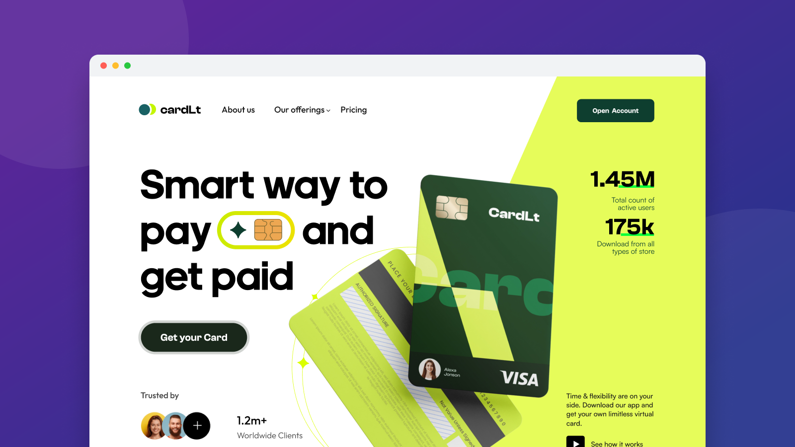
cardLt promises “a smart way to pay and get paid” — a virtual card app serving 1.45M active users with 175K downloads across stores. The landing page needed to make digital money feel effortless, trustworthy, and modern.
The Challenge
Fintech visitors carry high skepticism and low patience. The design had to establish scale instantly, showcase concrete money features (not vague promises), and reduce sign-up anxiety with a visible, simple onboarding path.
Design Approach
- Stats-anchored hero: “Smart way to pay and get paid” flanked by live-feeling counters — 1.45M active users, 175K downloads — with a “Get your Card” primary CTA.
- Feature reality: hold money in 30+ currencies, send money anywhere, track spending, personalized financial insights, and getting paid up to two days early — each feature paired with product UI.
- “See how it works” flow: a transparent workflow section builds trust by showing the mechanics, ending with a 5-minute “Register & Create Account” setup promise.
- App-store bridge: App Store and Google Play badges plus 1.2M+ worldwide clients repeated near every decision point.
Outcome
A conversion-oriented fintech page where scale proves safety, features prove utility, and the 5-minute setup promise removes the final objection — a clean template for consumer finance products.